Total Pageviews

Thursday, 21 February 2013

CHARACTER AND LEVEL DESIGN (LEVEL PROGRESS)

      Spent the day designing the level for the latest assignment. Keeping in mind pacing, indirect player controlling, tension, panic, excitement, sorrow and reward. The level has multiple levels to it (apartment floors), so I hoped to upload a GIF showing these levels and the key moments and events specific to this level (introduction level), but again, Picasion decided to have a mood swing. Have a look at the level sketches below!

COMMENTS AND CRITICISMS APPRECIATED!

REVENANTS - LEVEL DESIGN (START)
by Christian Whelan
REVENANTS - LEVEL DESIGN (4TH FLOOR)
by Christian Whelan
REVENANTS - LEVEL DESIGN (3RD FLOOR)
by Christian Whelan
REVENANTS - LEVEL DESIGN (2ND FLOOR)
by Christian Whelan
REVENANTS - LEVEL DESIGN (END)
by Christian Whelan
     
        The hardest challenge I had to overcome when designing the level was perfecting the balancing act when it came to realism and game play  I could have an extremely realistic level, with believability and atmosphere, but the real world doesn't facilitate game mechanics. Or, on the flip side I could have a level that entirely focuses around game play, but in doing so, sacrificing realism and immersion. Gears of War and Mirrors Edge are a great example of this balancing act. 

     Gears of War may have fantastical environment that are believable on the most parts,  but the concrete blocks that act as cover are clearly unrealistic, but its ok, because player accept this in favour of the game play - it's an acceptable trade-off in favour of the players experience.


      Mirrors Edge is a literal example of the two sides of the balancing act. On one end, the game has really interesting rooftop level  design that is both realistic and facilitating. However, the DLC had no realistic architecture, only primitive shapes to facilitate the mechanics - it was both entertaining and interesting. Both were enjoyable. 


         So, Looking at the realism of Gears of War and Mirrors Edge (which shares the same USP as Revenants) I could design successful level (or so I think) which is both realistic whilst providing architecture that facilitates free-running. So when it came to designing the level, answers to questions like what can the player see? What should they feel? Where would they go? These answers were all key when designing the scale, the layout and even the artistic effects of the level. But most importantly  especially in a horror game, all of these answers had to amount to an entertaining level that took the player on an emotional roller-coaster. 


In my head, it plays well. But I guess we'll have to see what my tutors say,


NEXT POST: CHARACTER AND LEVEL (DESIGNS)


Thursday, 14 February 2013

CHARACTER AND LEVEL DESIGN (CHARACTER PROGRESS)

      I spent the last 6 hours slowly (and I mean slowly) developing my character design. With a couple of hurdles and considerations to delete it and start a new (like I often do), I've almost finished the as of yet no name hero of the game Revenants, which I developed a partial concept document for and will form the basis for this assignment. 

Now, I was going to have a GIF detailing my stage by stage progress on the character. But picasion.com decided it didn't like that idea. So I suppose all I can do for now is show you where I'm up to until Picasion decides to stop having a mood swing.


COMMENTS AND CRITICISMS APPRECIATED! 

REVENANTS CHARACTER - IN PROGRESS
by Christian Whelan

        The concept of the game, although extravagant  is to set these fantastical events in a real and relatable world. Therefore, the character must also follow this core concept. I had to do three things - represent the theme, the characters abilities, the characters personality and the world itself.  

     I new what I was going to do and where I was going to go with this character, but I quickly realised, the character was just turning out to be an average Joe in a jumper. Annoyed by this realisation that the character could be anybody in any game, I decided to build on some extra features - he's supposed to be an average Joe, but he has to fit within the world and situations he would face in the levels. 

      So, from this, I added in the strap holding the tins (to represent survival and efficiency required in order to survive), the not yet finished keys (to represent to need to collect resources) the key ring (to add personality), the rips in the jeans (to reflect the rough living and free-running), the cut (to represent the dangers) and the tag (to represent the abandonment of personal appearance priorities).

Another couple of hours and this guy should be done, named and detailed. It's coming along really well. let's just hope the level does!

NEXT POST: CHARACTER AND LEVEL DESIGN (LEVEL PROGRESS)

CHARACTER AND LEVEL DESIGN (THE CONCEPT)

           Develop, design and detail a character and level that fit within the same game world - the next assignment set in my second semester at Futureworks University. Thankfully, I already have the foundations for this assignment. The game I already created a pitch document for - Revenants. 

     To summarise it, the game is a post apocalyptic (cliché I know), zombie (cliché I know), first person shooter set in modern day Manchester. The unique selling point? Free-Running and a focus on defence rather than offence, with a touch of extreme survival mechanics. Rather than ramble on about it, I'll just show you the few pages of the in progress concept document for it.

                      COMMENTS AND CRITICISMS APPRECIATED!

REVENANTS (PITCH DOCUMENT) - FRONT PAGE
by Christian Whelan
REVENANTS (PITCH DOCUMENT) - CONTENTS PAGE
by Christian Whelan
REVENANTS (PITCH DOCUMENT) - WALKTHROUGH
by Christian Whelan
REVENANTS (PITCH DOCUMENT) - OVERVIEW
by Christian Whelan
REVENANTS (PITCH DOCUMENT) - KEY FEATURES
by Christian Whelan

      Like I said, thankfully I already have the foundations and ideas there. Taking theses pages, I can already design the level (the walk through), reference and create a visual style (previously collected reference images), create the character and story (previously developed brainstorm notes) and finally, detail the key events (the Overview / Key Features) and evoked emotions (the Walk through).

So I best get designing the character for this assignment which again, thankfully, I already have sketches off. It's just a matter of being able to implement what I've learnt on this course since I developed this pitch document, into the character, his/her story and level I have to design. Oh, and the ability to draw, that's an important part as well...

NEXT POST: CHARACTER AND LEVEL DESIGN (CHARACTER PROGRESS)

UDK LEVEL (FIXING AND ADDITIONS)

          Play testing session taken into account, I went back to fix, develop and refine my in progress UDK mapWith the time limit being as constricting as it was, I didn't have the freedom to really take the map where I wanted it to go and make those dramatic improvements I wish I could of made (the scale of the large bases). However, regardless of these constraints, I still managed to fix some of the issues and make some additions, Take a look at the screenshots below and I'll discuss them later on in this hopefully small post.

UDK LEVEL - ADDITIONS
by Christian Whelan

The GIF is in the order of the additions I made to the map, so I'll start with the first image.

Considering the time constraint and therefore my inability to make any drastic modifications to the scale of the map, I had to find another way to make running around the map less of a chore every time the player dies. So, in order to do this, I added in jump pads in two places - the bridge and the small bases. Two on the bridge and one on each small base. The two on the bridge take the player to their corresponding large base, which in turn, creates a second entrance and exit in some sense, as the player can also jump to the bridge using the same method. The jump pads on each small base take the player to the base on their left-hand side. I believe these additions dramatically improve the map and pace of combat whilst still allowing players to roam near the 'Pit' if they so wish to.

The next Addition was the teleporting points - two within either large base. These teleporting points replace the bugged large jump pads that caused confusion for those in the sniper tower. Now, there is a teleporting point in each base's first floor that leads to their own tower and back. Again, this is a major improvement considering this was the reoccurring complaint in play-testing.

Another criticism was that player never fell to their death when they supposed to. A simple fix for this, was to add a kill box - I did this and thankfully it works.

Finally, and in theory most importantly, I added some coloured lighting in order to distinguish between sides of the map. Personally, I believe the map was too confusing and therefore lackluster in the visuals. Considering this map is designed to be a Deathmatch, Team Deathmatch and Capture the Flag map, it only made sense to make these colours blue and red (in classic Unreal Tournament fashion). Not only this, but these colours are contrasting and complimenting, allowing players to easily distinguish where they are, and in the team based modes, what team they are on.

       So in all. I believe these addition make the map what it should have been, even if the map itself is not what it could have been. Even so, I think I did a good enough job with the time, knowledgeable and experience I had. However, there where a few things I could (and on the most part, tried and failed) to add in to take the map even further - sounds, lighting types and materials. In terms of further improvement or considerations, I thin I could of thought about weapon, ammo, and vehicle placement a little but more, but I guess time constraints just got in the way.

Maybe on the next map!

NEXT POST: CHARACTER AND LEVEL DESIGN (THE CONCEPT)

UDK LEVEL: PLAYTESTING

      I finally got to play-test my UDK Level with real life players! I hosted my server and 11 players joined. The results were great, but as expected, I found some issues brought up by friend mid-play, hilarious ones at that.  Some were game breakers that could be exploited, and some where spoil inconsistencies in the map.

PLAYERS COULDN'T GET DOWN FROM THE SNIPER TOWERS - The jump pads are too confusing, so in order to make things sniping a little easier and less taxing. I shall learn how to implement teleporters in UDK and place two for each tower - one for the tower room and one for the second floor of the large structures.

TEXTURES MISSING AROUND THE MAP - Mid-play, many players told me a texture was missing. I've written them down and will simply fix them. In fact, I may even change up the textures altogether to make the map a little prettier.

PLAYERS FOUND THE MAP CONFUSING - A concern I shared throughout the development process. Its perfectly symmetrical, therefore it's incredibly hard to know which side is which. Especially considering there is absolutely nothing to distinguish both from one another. Either I will add some coloured lighting into the mix (which will also facilitate other game modes) or I'll modify the structures. 

INVISIBLE FLOATING PATHWAYS - At one side of the bridge, an invisible path leads upward towards one of the large structures  Although funny, it meant one of the players could exploit it - they could shoot through it but none of the other player could, putting them at a disadvantage.

BOUNCE PAD LOOKS UGLY - The large bounce pad that caused confusion for the sniper towers are so large they have bugged out. Because of this, it looks ugly. Fortunately, I am replacing them in favour for the teleporting points.

INVISIBLE WALLS - My tutor (also play testing my level) found that the second floor of the large structures has an invisible wall, meaning players couldn't and can't get down from the room unless they use the stairs. I have no idea why this is, probably another resultant of constant extrusion from one brush or interconnecting verts. I'll have to investigate this.

PLAYER NOT DYING FROM LARGE FALLS - The main pit in the middle of the map was supposed to be the balance for risk and reward when it came to the vehicle and UDamage. Players are supposed to fall and die if they miscalculate the jump. The problem was and is, that players didn't die. They fell to the bottom and fell into the infinity space. An easy solution, will be to add a death zone to ensure automatic death.

     Overall, I think the play-testing went really well. Players enjoyed it and my level was given its fair share of compliments. However, it clearly has issues and although I am happy with it, I know it's far from perfect. The next step is to fix and polish these issues. Hopefully, with some success.

NEXT POST: UDK LEVEL (FIXING AND ADDITIONS)

UDK LEVEL: IN PROGRESS (TEXTURED)

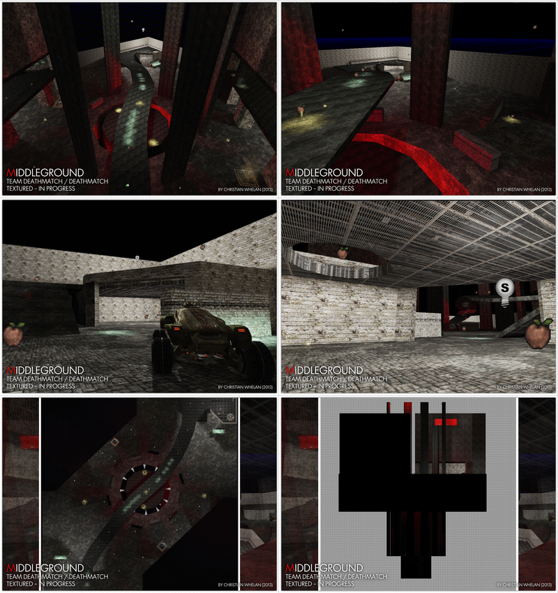
      What was supposed to take me 3 hours, took me 8 hours. 8 solid hours of university work out of class to get the last two buildings constructed, add in the actors and paths and apply the textures. I lost my work twice and had to start again, and in doing so, ran into many game breaking bugs that prompted drastic design changes to the map. The result? Something I'm happy with, but not elated about. Take a look at the textured map (still in progress) below.

COMMENTS AND CRITICISMS APPRECIATED!

UDK LEVEL - TEXTURED (IN PROGRESS)
by Christian Whelan
UDK LEVEL - THE ARENA
by Christian Whelan
UDK LEVEL - THE BRIDGE
by Christian Whelan
UDK LEVEL - THE PIT
by Christian Whelan
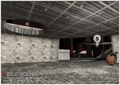
UDK LEVEL - THE SMALL BASE
by Christian Whelan
UDK LEVEL - THE SMALL BASE (INDOORS)
by Christian Whelan
UDK LEVEL - THE SNIPER TOWER
by Christian Whelan
UDK LEVEL - THE MAP (TOP-DOWN)
by Christian Whelan
UDK LEVEL (SIDE-VIEW)
by Christian Whelan

    The first thing to mention is the two buildings (or one, if you consider they are duplicates). To be honest  I don't like them, they add verticality and variety, but the size ratio between the player and the rooms is to drastic - it looks cheep. 

    Secondly there was the planned second bridge. Now, this was in construction, but due to it being an extrusion of the already complex building, there arose some clipping and collision detection issues, so I had to delete it. Deleting the glitch ridden bridge only caused more problems though. Visually the bridge was no longer there, physically, it was - any object paced near it would disappear. I still don't know why this was, but I just welded vertexes together to hide the giant glitch hole. In it's place? A jump pad.

    So now, the map was seemingly complete, I added in the items and vehicles. The idea, was to have the action drawn to the middle. So, the most powerful vehicles and UDamage is placed in the middle, and the lesser vehicles, power-ups and weapon are around the four buildings. Less useful, but still beneficial power-ups where hidden and the ammo was spread out evenly around the map, especially around the middle where it's always close to a player - this keeps the action going.

    Finally I made some improvements and textured. The improvement was the third floor (connected by jump pads) facilitated by taller building to provide sniper points and variety. I liked the idea, considering the maps size was an issue, I might as well embrace it. Finally I textured it, which to be honest, I'm not happy with. Along with the lighting, the map just looks bare, boring and confusing.

Now that I've added everything and the bots work fine, I need it play test it to see how it really player with real players. Only then, will I know if there are any glitches and if it even plays like I want it to.

NEXT POST: UDK LEVEL: PLAYTESTING